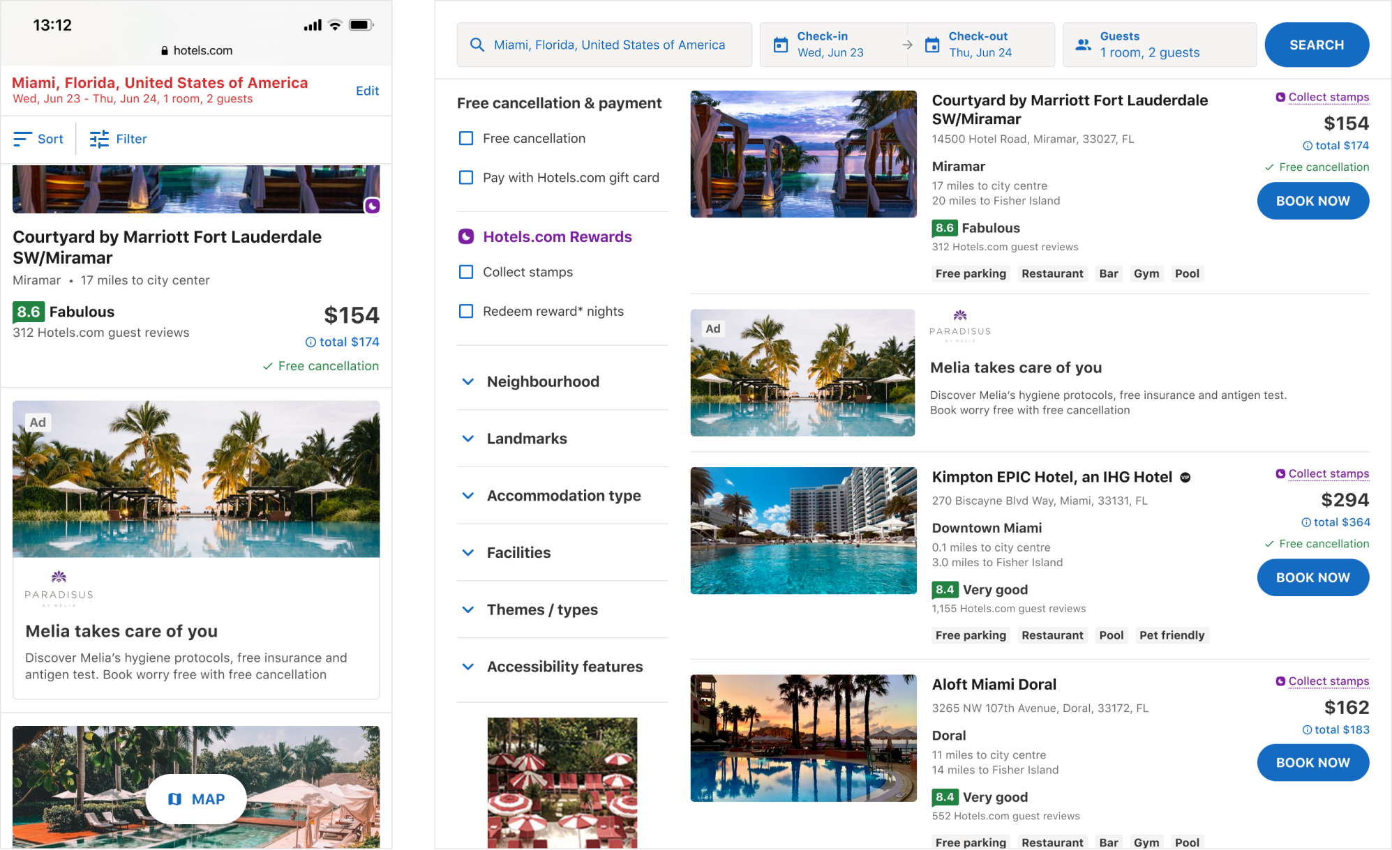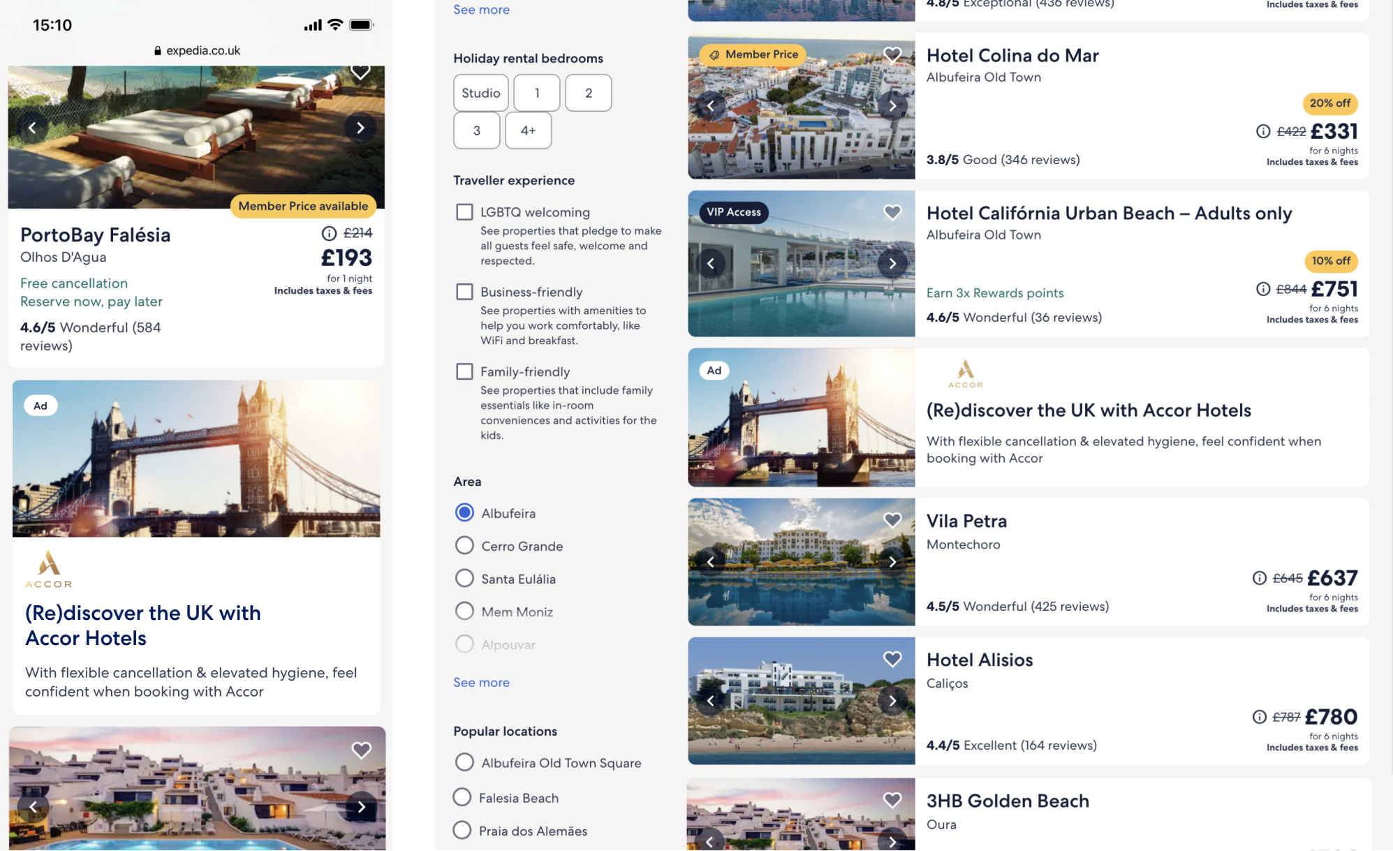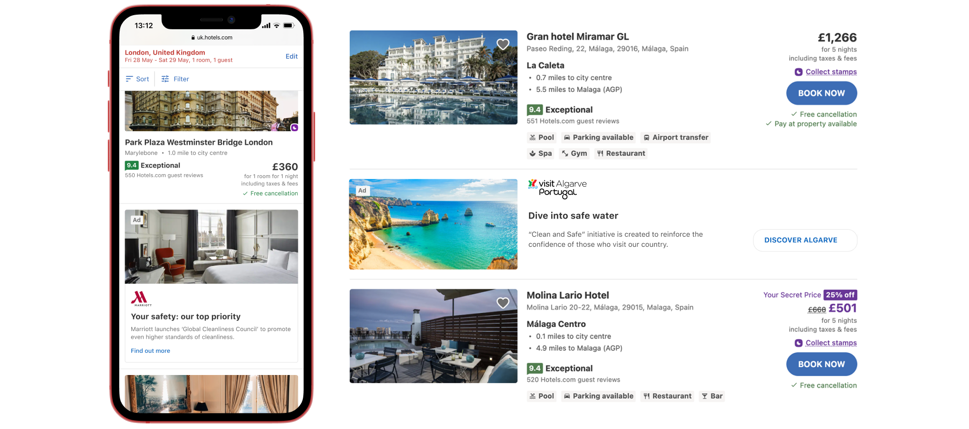
Brands Results Listings
Since Covid19 we observed a change in Customers behaviour and Advertisers need to share different messages.
Brands Results Listings is an Ad product part of "Covid19 recovery inventory" strategy that Media Solutions launched in April 2020, and has been designed, tested and implemented within 2 months.
It has been a great example of collaboration between Research, UX, Product and Tech teams across Expedia Group.
Goals
- increase CTR and CVR
- reassure traveller customer
- create trustworthiness
Limitations
- Ad content
- Targeting
- Landing page CMS
Methodology
- Customer Research
- User Testing
Customer behaviour
Since Covid-19, three main changes have been observed in customers behaviour:
Distance
Domestic Travel
Travellers want to avoid mass transportation and being closer to home gives a feeling of safety and people are aware of restrictions and regulations in that region.
Type of destination
Non-crowded destinations
Outdoor and remote destinations are preferred to city-breaks or crowded locations.
Timing
Last-minute & short term
Due to continuous and quick changes, planning a trip has become a risk, so better book when everything feels safe.
Covid19 had a deep psychological and financial impact on people’s everyday life. This has impacted also their relationship with travel, although many people are already dreaming about their next trip after months of being at home and isolated.
New Customer needs
New customer needs have emerged and some shifted from ‘nice to have’ to ‘must have’
Flexibility
Being able to change or cancel, at no cost, in an autonomous way through their account.
Cleanliness
Willing to spend more but book a nice and clean hotel they trust. Vacation Rental properties with private amenities will be a more suitable accommodation that favours social distancing.
Pricing
Jobs at risk and recession.
Deals and discounts will play a key role.
Communication
They would like to be updated about changes or issues with their booking, also they would like to be informed about rules and regulations of the destination.
Sources
- Expedia Group internal research study
- https://skift.com/2020/04/13/singapore-shows-what-the-new-clean-is-with-audit-initiative-for-hotels/
- “Culture Trip - insights” @ ecommerce Design summit 2020
New Advertisers needs
Advertisers needs have also changed and now have different messages to share with customers
DMO
Destination Marketing Organisation
As a DMO, I want to spread awareness about the various steps our destination has taken to ensure the safety of our travellers and to promote the attractions and activities in the region.
Domestic destinations
Promote the different cities/towns domestically and attractions they offer.
Safety communication
Raise awareness on steps destination has taken to ensure safety of travellers.
Hotels
As a Hotel, I want to showcase the rigorous cleanliness and sanitation measures taken to welcome our guests back to build trust and confidence in booking their next stay with us.
Hygiene awareness
Reassure customers by promoting awareness of their new sanitisation protocols.
Build trust
The solution lies in the problem
How might we...
… Help customers reduce the uncertainty surrounding booking a trip?
… Help advertisers disclosing useful information about rural, non-mainstream destinations rules and regulations?
… Adapt to different customer needs (domestic travel and rural destinations)?
… Help advertisers promoting attractions and things to do in their area?
… Reassure customers about levels of hygiene and cleanliness?
… Allow advertisers to explain in to depth their new sanitisation protocols, what they changed and improved in order to guarantee the maximum safety for their guests?
Brands Results Listings: concept
We proposed a new native in-line product to help deliver Hotel/DMO Covid-19 related messages aiming to reassure customers.
Hotels: allow Brands to communicate the immense work they have done to ensure a safe stay.
DMO: delight customers with alternative destinations that allow for discovery of new places they may not have thought of.
Customers: help travellers find the best value, quality accommodation in a great location that suits the travel criteria & to shortlist possible options for the trip.
Themes
- Cleanliness
- Safety measures (eg. social distancing)
- Booking flexibility
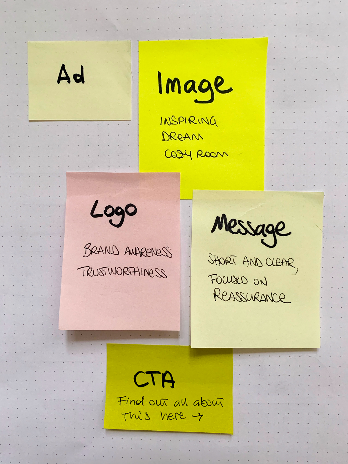
Key Features
Image
- DMO: Inspiring travel imagery, immersive beautiful landscape, enhance privacy and social distancing (eg. avoid crowded beaches)
- Hotels: Evoke freshness and cleanliness, a clean and tidy room, enhance social distancing. Avoid pictures featuring cleaning products.
Logo
To promote brand awareness and inspire trustworthiness.
Message
Short and clear message that reassure customers, use at least one of the 3 main themes.
CTA (optional)
Invite the traveller to find out more in a separate page.
Relevance
Content and relevance are very hot topics when developing an Ad product.
Most User Testing and Research revealed that Customers are frustrated by ads and do not want to click on them because they are irrelevant, not trustworthy and the message does not provide any information or value.
In order to guarantee Customer reassurance and relevance we added more specific targeting:
- For Hotels: display only Brands that have available properties in the searched area;
- For DMO: display Ads regarding similar destination or domestic (near User's location).
End-to-end experience
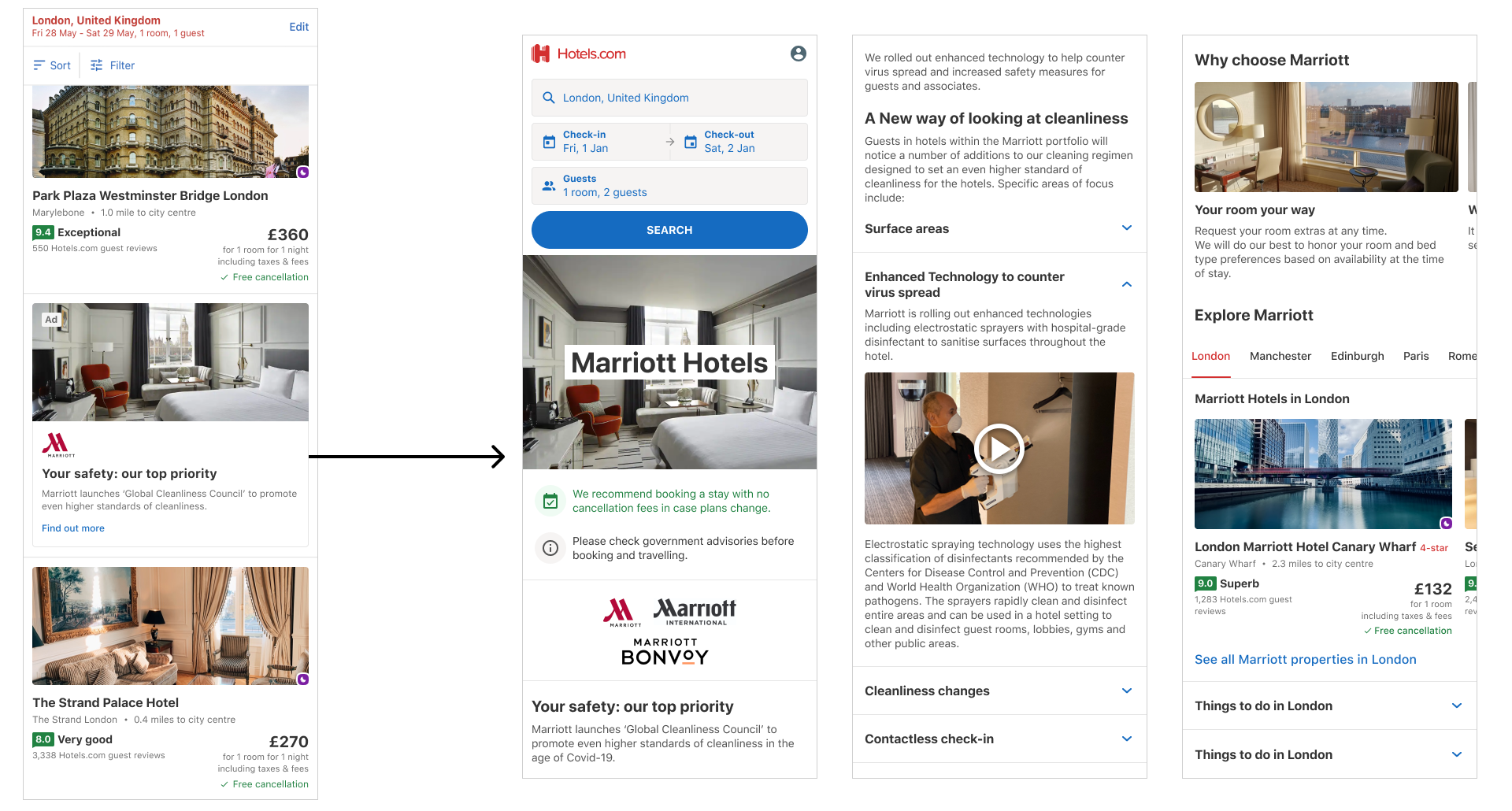
The User search for a destination and land on the search results page:
- The Brand Results Listings is displayed along with the available properties in the selected destination;
- By selecting the Brand Results Listings the User reach a landing page;
- The User can decide to go back to the search results page by selecting the "go back" button at the top of the page or continue exploring the content;
- From this page the User can see available properties for their selected date and destination;
- By selecting one of these properties, the User reach a Property Details Page where is possible to select the room and book (Hotels.com/Expedia UX).
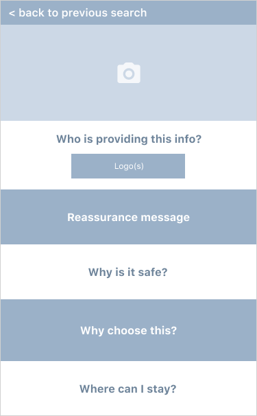
Landing Page IA
We have standardised landing pages templates that work across multiple brands.
For this reason it is very difficult to change their structure and functionality but for this particular product was necessary to define specific content hierarchy in order to provide a good User Experience aiming to reassure travellers.
The primary content should be very focused and any additional details about the Brand or Organisation need to be moved lower in the page to give priority to the main reassurance message.
As a Customer I want to
- Go back to the Search Results Page
As I have just clicked on an Ad I want to be able to exit this page and go back to my search. - See a nice inspirational image
I am going on holiday and I want to choose a nice location / a clean hotel. - Know who is providing this content
As this is an Ad I need clear information of who is providing this content. - Know why is is safe to stay in this destination/hotel
I would like to know what measures have been adopted to guarantee my safety. - Know why would I choose this destination/hotel
What are the main features and services that would attract me to visit? - Know where can I stay?
The measures you adopted reassured me to visit your destination / stay at one of your hotels. What are the accommodation options available? And what are the prices?
Design & User testing
I designed the unit and the landing page to gather users feedback.
With the help of Research Team we created a test focused on hotel brands, the main goal of the study was to understand:
- Does the product reassure travellers?
- Do they find it useful?
- Because it is an Ad, does it affect its usefulness?
- Does the landing page content provide enough information and reassurance?
- What the User expect to see when the Ad is selected?
We tested on 20 American Users, using mobile device.
10 users - that normally book with Chains Hotels / 10 users - that normally don't book with Chains Hotels.
User Testing outcome
Reassurance & Ad perception
Overall customers appreciated the information and felt reassured.
Although being an Advertisement they expect to read a positive message but they cannot be sure if it is true unless they see with their own eyes.
Usefulness
Users understand why big hotel chains would like to share such a message. Although it would not particularly convince them to book with that brand unless they were already keen.
UX expectations
20% of users expected to be taken to the Advertisers website.
80% of Users expected to be taken to the landing page.
Landing page
All Users considered really useful how each safety measure has been explained into details and definitely reassures them. When reaching the landing page they seem to ignore the fact that they selected an Ad and are actually positively impressed by the cleanliness and hygiene efforts.
UX observations
In my career I noticed that testing Advertising Products is very hard to interpretate.
During User Testing the User feels judged and knows that someone is watching, so they are scared to do mistakes and they always declare that they are not keen on using Ads.
Real-life is quite different, as the User might still check out the content, even just out of curiosity. The conversion rate on our landing pages speak for itself.
Brands Results Listings: launch and performance
The product has been launched in June 2020 on Hotels.com and Expedia, on all points of sales.
On Hotels.com it is displayed after the 7th listing of the search results page, on Expedia after the 10th.
Performance: CTR 0.23%, sold revenue $3.6M.
Example of Hotel "Brands Results Listings" on Hotels.com, US point of sale.
Moving forward
Due to its great performance and customer centricity, the Brand Results Listings has been widely appreciated not only by our customers but also by internal stakeholders.
Initially thought for hotels and destinations, this product is now displayed also on flights search to provide additional information about hygiene and cleanliness on board.
We will keep iterating on this product which is now fully part of our websites experience.


