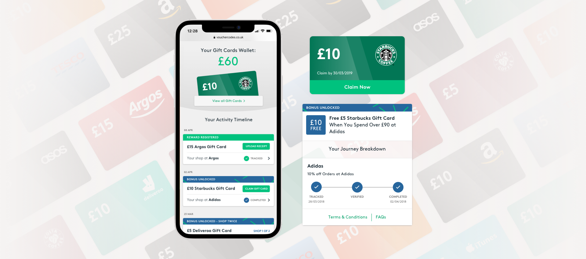
VoucherCodes Account Wallet
The account wallet is where Users can easily track the status of their rewards and manage gift cards.
With this feature we are aiming to reduce Customer support queries and encourage Users to earn more vouchers.
We started from a workshop where UX, Product, Engineers and Customer Support Teams framed User and Business problems, defined desired outcomes and gathered all requirements.
I have been leading this project from a UX perspective, facilitated the workshop, run User Testing, designed the product and worked closely with Engineers during development.
Goals
- Reduce Customer Support queries
- Standardise gift card tracking
- Drive repeat visits
- Increase Gift Cards redemption
Challenges
- Merging loyalty and rewards
- Keep different offer mechanism clear
- Choose the right language
Methodology
- Benchmarking
- User Testing
Problem framing
Customer
• Long list of vouchers
• Additional actions not called out
• No distinction between active/inactive offers
• Gift Cards not displayed
Business
• No distinction between Rewards/Loyalty offers
• 'Loyalty' offers incomplete
• High number of Customer Support tickets
• Gift Cards not claimed
Customer problem
Users land on the Merchant Page, select an offer, copy the code and complete the purchase on the merchant website.
To track a purchase might take us few days or more, also sometimes the purchase does not meet T&Cs requirements so is not valid and the User cannot earn the gift card: this causes a huge number of Customer Support tickets, as well as frustrated customers.
Business problem
VoucherCodes offer two different types of offer: 'Rewards' are Gift Cards financed by Partners, 'Loyalty' or 'Bonus' are financed by VoucherCodes.
Bonus offers require multiple shops, their aim is to incentivise users to complete multiple transactions and using more of our offers.
This difference does not have any impact on User experience, ultimately they get a Gift Card with either.
Gift Cards redemption
The current layout of the "Rewards" section also don't display clearly when the Gift Card is ready to be claimed, Users normally get notified via email about it but ideally we should show this information in this section as well. This also causes a number of Gift Cards which are not claimed and then expire, costing money to the business.
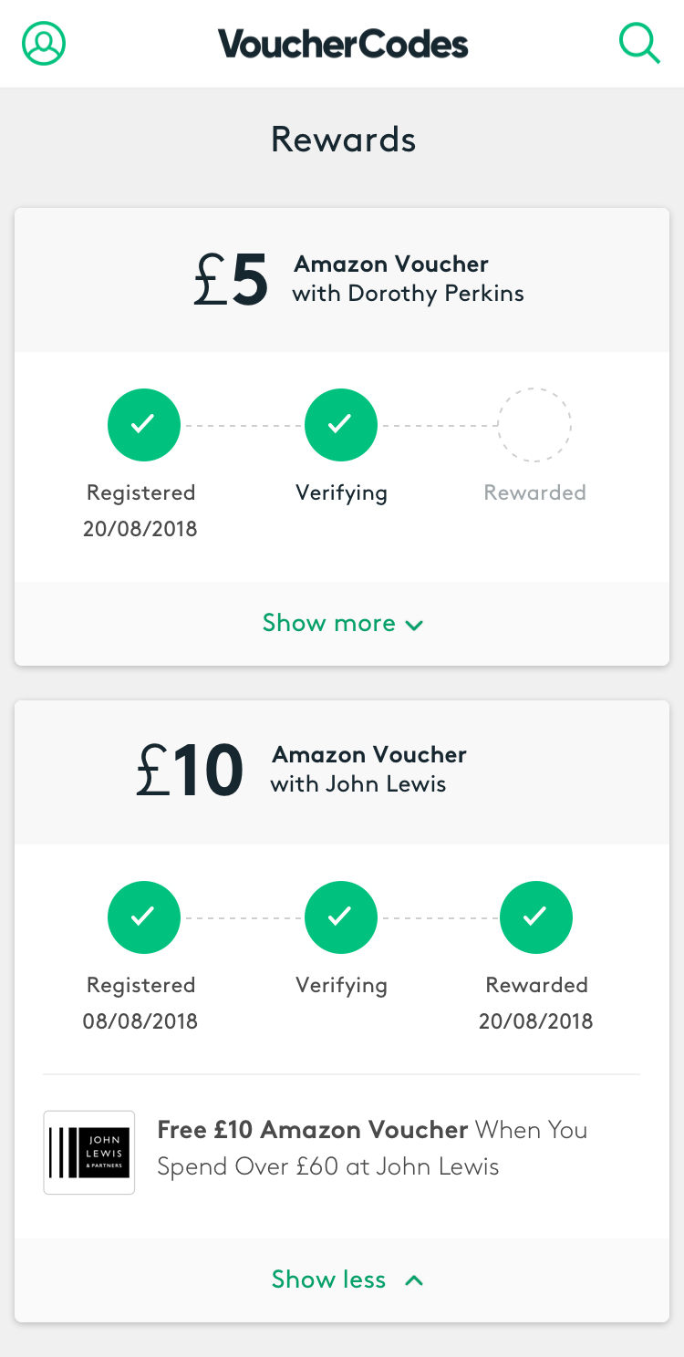
Reviewing the User flow
As a User I want to be able to
Understand if my purchase has been tracked
If not understand why
How long shall I wait for before contacting support?
Do I need to take further actions?
Understand how 'Loyalty offers' work
Do I need to take further actions?
Which merchants are valid for this offer?
Understand why I cannot see my code
Do I need to take further actions?
Did I use it already? When?
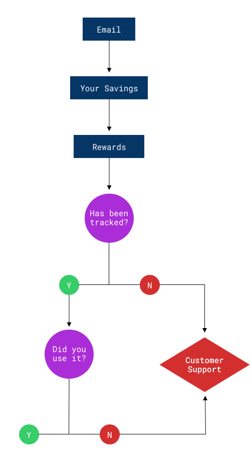

New User Flow
The new User flow adds an additional layer of information before reaching Customer support.
From this section of the account Users should be able to understand the status of their offers and if further action is needed in order to get their reward (upload a receipt or complete an additional purchase).
This is aiming to reduce interaction with customer service and increase Customer satisfaction by keeping them up do date on their reward status.
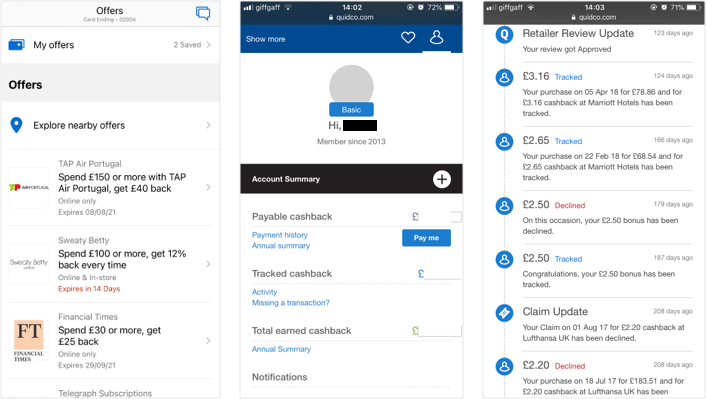
Benchmarking
Account areas are very complex products, it is very important to display substantial information with particular focus on the transactions.
Financial apps such as personal banking are very good examples to look at as this industry invested a lot into Research and User validation.
I participated in some studies as a “User” in order to grab valuable insights which have been really useful when setting up the User Testing for this project.
Apps and websites analysed
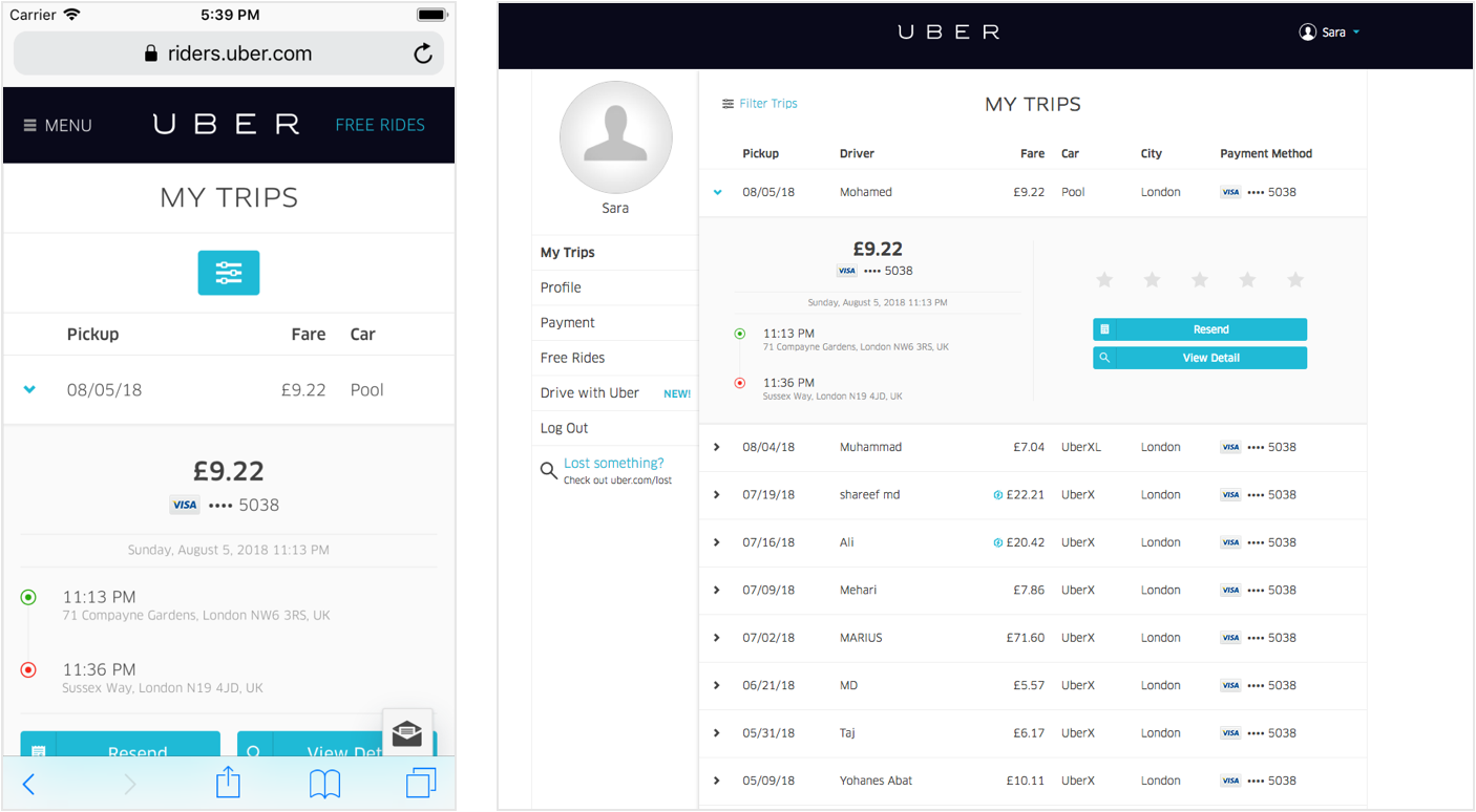
• Uber
• Quidco
• Amazon
• Barclays
• HSBC
• American Express
Key Findings
• Large amount of information progressively disclosed
• Use of the Timeline
• Colour-coding transactions to highlight issues
• Displaying buttons when action is required
Brainstorming ideas
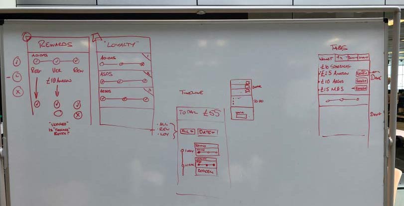
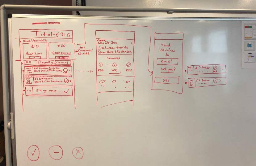
The UX team gathered around the whiteboard ready to sketch-out our ideas.
Before starting conceptualising the Account Wallet we defined the information architecture and made sure we communicate effectively with our Users by using understandable terminology and clear visual language.
Defining IA
Information should be clear and straightforward, any additional detail should be progressively disclosed.
Main elements to be highlighted:
Action required
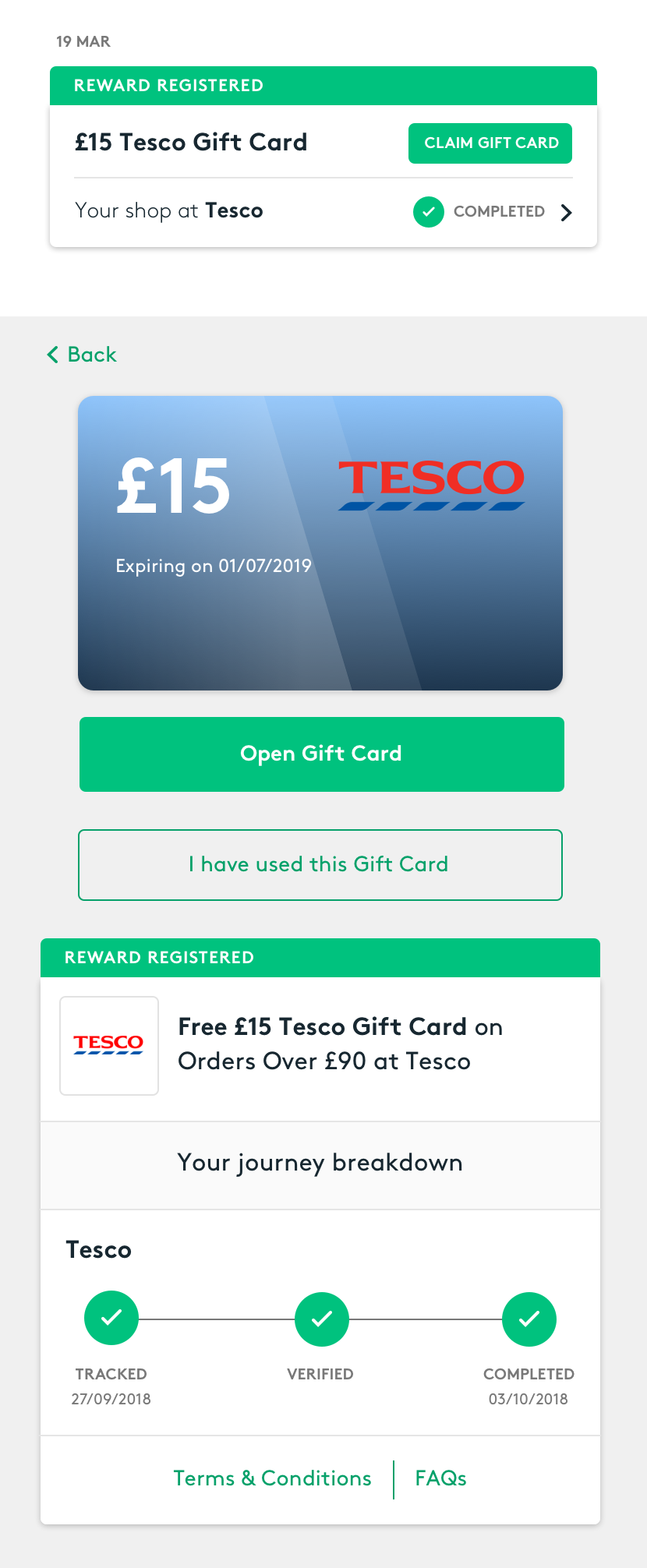
If the User needs to take further action it should be explicitly indicated.
Error states
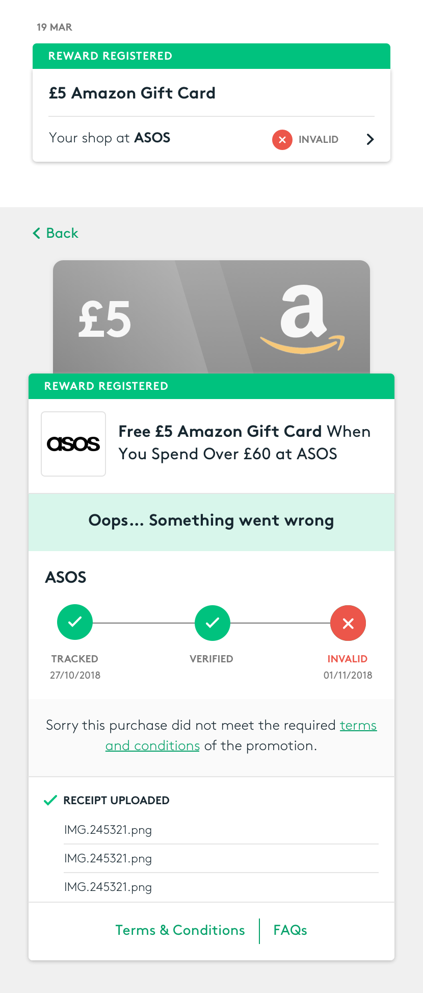
These should be immediately visible and containing information and instructions.
'Pending' state
Complement with a quick overview on how long it can take to track a purchase.
Prompt to redeem code
Highlight when the Gift Card is ready to be redeemed.
Choose the right language
Terminology
Terminology is extremely important, it is the key for a honest relationship with Users. We asked them for feedback through a survey.
'Verifying' or 'tracking'?
"Tracking" was preferred.
"Verifying" raised questions such as "who is verifying: the merchant or VoucherCodes?"
Loyalty - Rewards - Bonus
"Rewards" are offers financed by Partners, "Loyalty" or "Bonus" are financed by VoucherCodes.
The business would like to highlight this and create awareness but in truth nothing really changes for Users: their goal is to get a Gift Card, and multiple naming just makes things confusing.
"Bonus" was the preferred naming.
Visual language
Visual help User scanning information quickly and efficiently: layout, spacing and colour allow Users to immediately identify issues and to focus on what's important.
Rewards and Bonus colours
Using the same colours as on the 'Merchant Page' will allow Users to recognise the offer.
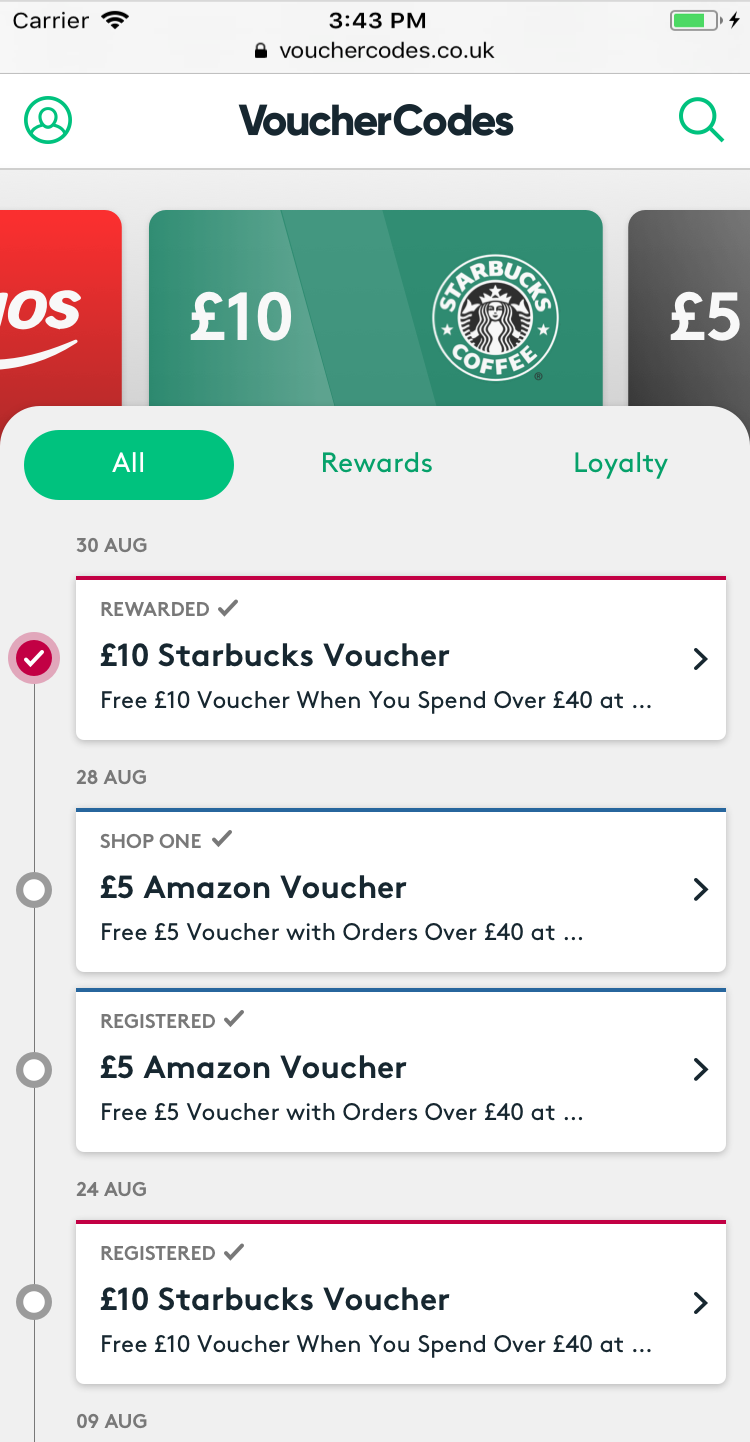
Timeline
Easily retrieve transactions.
Traffic lights system
Green - yellow - red are widely recognised colour-coding. We should experiment this idea and guarantee accessibility standards.
Design & User Testing
I evolved the initial concepts and created the first designs of the Account Wallet which have been tested remotely to gather initial feedback.
The designs have been reviewed with Product Managers, Customer Support and Tech Team to discuss feasibility, gather their feedback and suggestions.
At this point I created two prototypes which have been used for the first in-house User Testing session.
User Testing
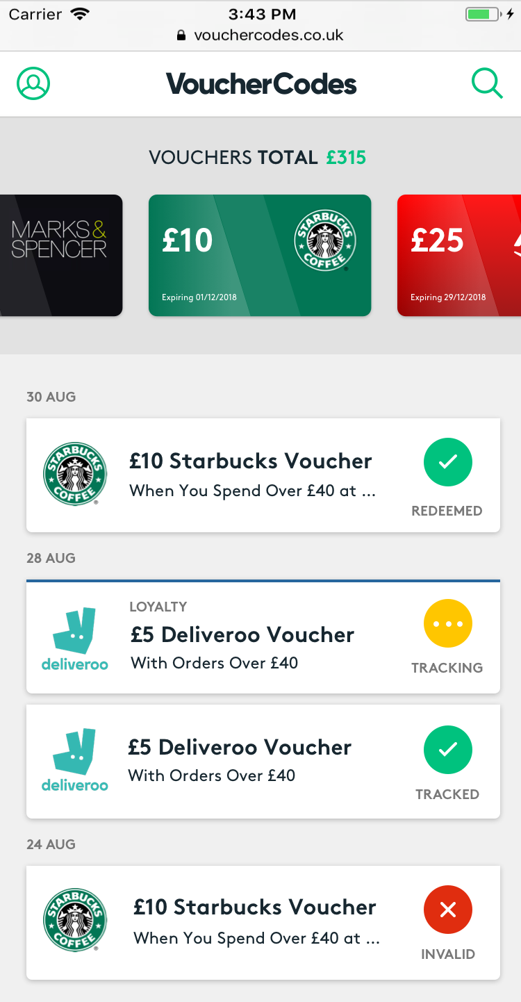
Users liked both prototypes and found them easy to navigate, they stated that this new feature is much better than the current "Rewards" section.
The dated timeline has been considered extremely useful and clearly display the offers used.
The "Offer" screens are functional and straightforward, Users were satisfied and reassured by the information and the process breakdown.
In each design things to improve have been highlighted:
V1
Segmented control
Users found it confusing “Rewards” and “Loyalty” segments, they don't understand why they are separated.
Timeline
Too much text and offer status not clear
V2
Logos in the timeline
Users found it confusing, they think it represents the offer they selected.
Loyalty offer
The offer status is clear, but is not mentioned which shop has been tracked and if an additional shop is needed.
V1
V2
Refinement & final User Testing
Timeline & Gift Cards
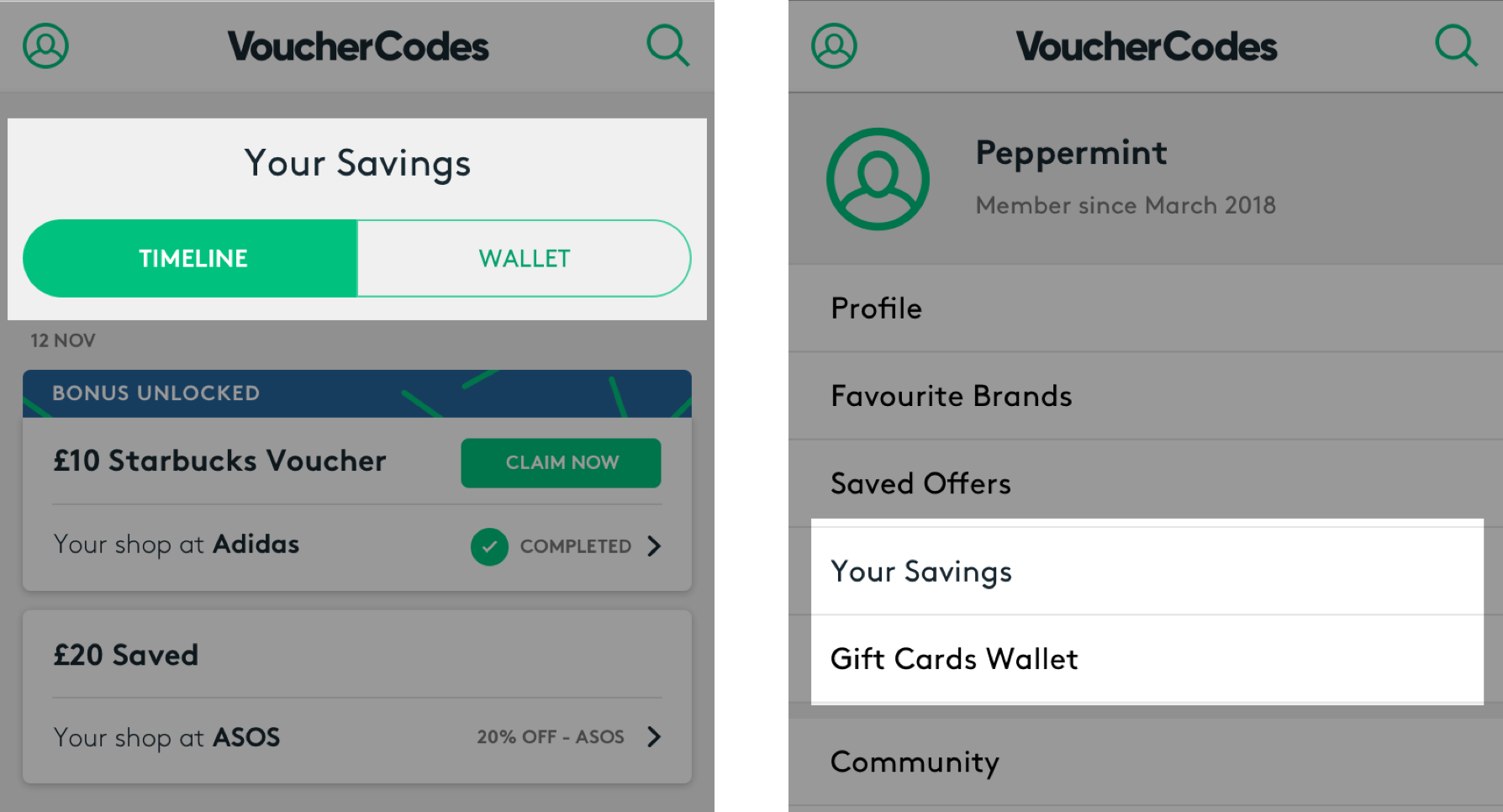
We noticed that Users tend to remain in the displayed screen, so we wanted to test having 2 different screens for “Gift cards” and “Timeline”:
A segmented control within "Your Savings" that allows the User to navigate between the timeline and the gift cards.
"Your Savings" and "Gift Cards Wallet" as two separate screens within the account section.
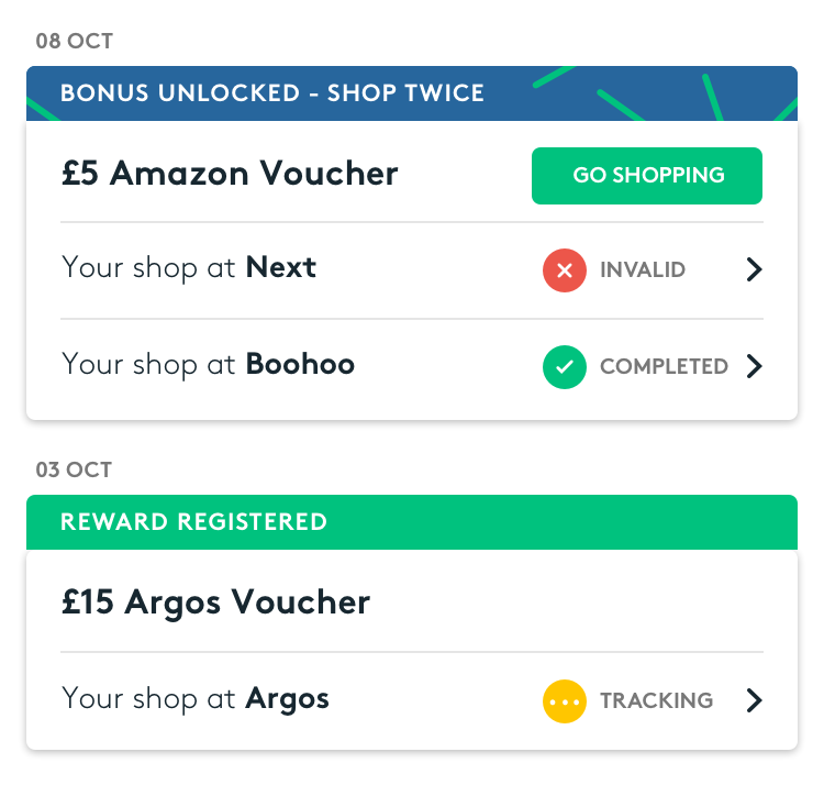
Offers
Simplify UI;
Compromise between business and Users needs (bonus/rewards);
Introduce CTAs for required actions.
Final User Testing
We invited the Users again to get a final feedback.
The segmented control variant was preferred by Users. Although we observed the interaction with the second prototype was smoother, as if it was more logical for Users to go to "Account" to navigate between the two different sections.
The timeline was much clearer: right amount of information, additional details disclosed within the "offer detail screen", required actions clearly called out.
Users loved this new feature and were looking forward to use it soon. It was emotional for them to come into our office for User Testing, they felt appreciated, involved and actively participate in the process. Has been a great opportunity for us to be closer to our Customers and to reinforce Brand Loyalty.
Account Wallet: launch and performance
The Account Wallet has been launched in February 2019, after 6 months we reviewed performance, specifically 'Customer Support tickets' and direct 'Account visits'.
The Account area interaction has increased by 3.2%, a good start considering that our Customers were used to checking their Rewards through emails only.
The biggest achievement has been definitely 'Reducing Customer Support tickets' which decreased by -21% which exceeded expectations.
Customer Support queries
Account visits
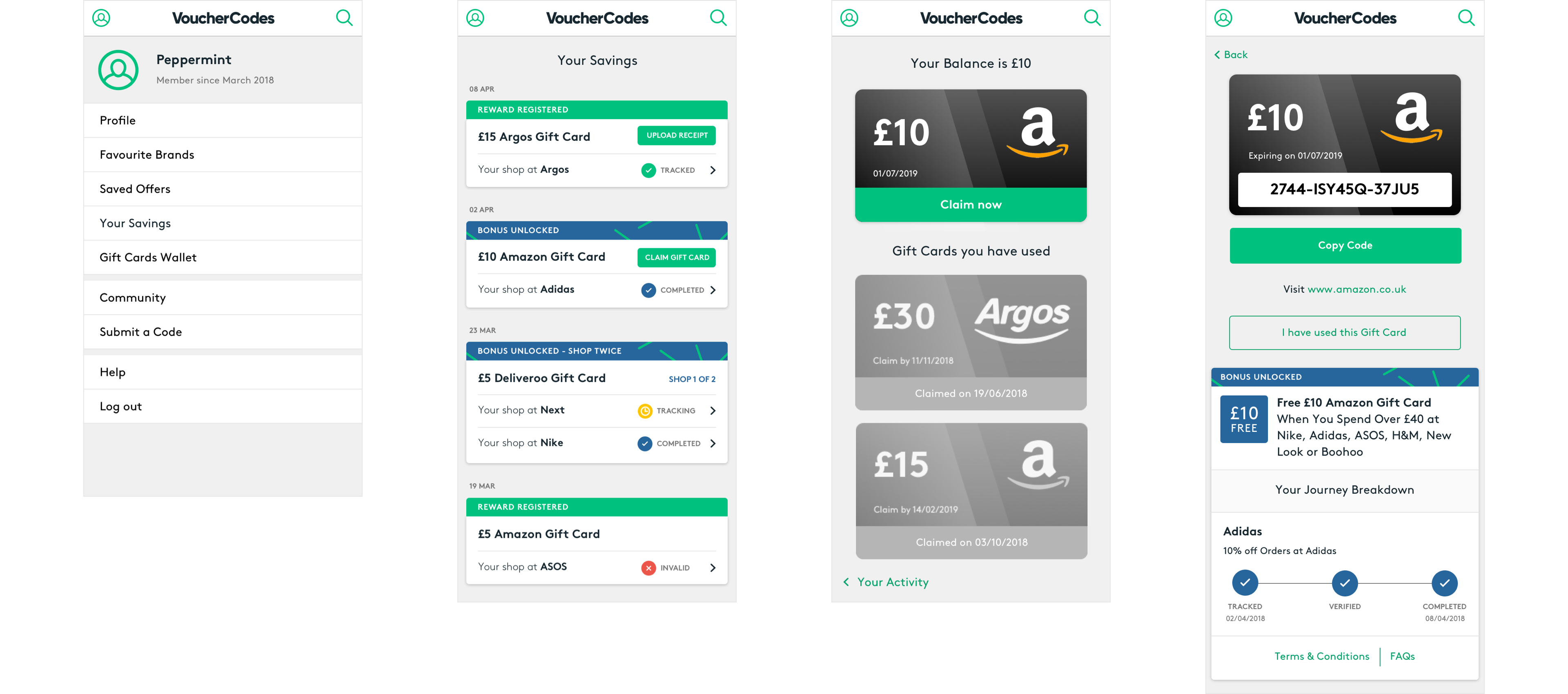
Offer detail screens
Error state
Invalid purchase
Action required
Upload receipt

Complete
Redeem Gift Card
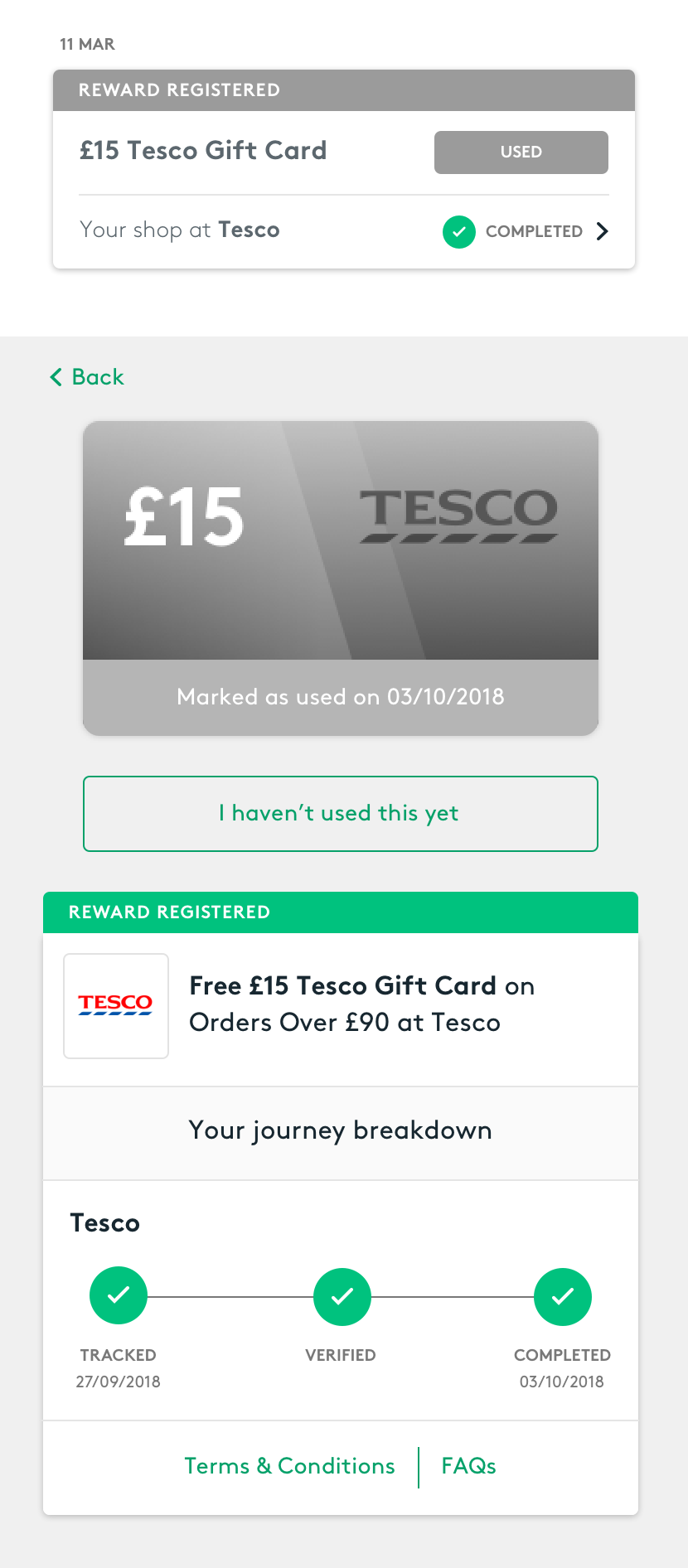
Inactive state
Gift card claimed
Moving forward
The Account Wallet has been a big project that involved UX, Product, Tech and Customer Support and has demonstrated great team work and communication.
Most of the goals have been achieved, in particular standardising gift cards tracking and redemption processes and reducing Customer Support tickets.
This last one in particular will have a positive impact on Brand Loyalty: Users are now able to access information straight away from their account, they can track their offer status and perform actions/resolve issues autonomously. Empowered customers are happy customers.
In the future we would like to review the feature and ideally we would like “Your Savings” area to be the main entry point for offers tracking rather than emails.
